KDE

Lancelot is … launching?

This one will be short. For more detailed information, and a FAQ like discussion, go to the previous blog post about Lancelot… especially the comments section.

Lancelot works

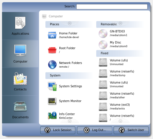
As you can see in the screenshot (compared to the previous one), there are real items in the menu. Yep, Lancelot now shows devices, places…

… and you can witness the item squeeze/expand feature of the list widgets.

  • E-mail this story to a friend!
  • Digg
  • Technorati
  • del.icio.us
  • TwitThis
  • Google

23 Comments »

  1. Will there be a possibility to scale down the left pane (horizontally if nothing else)? Seems pretty big to me…

    Comment by Someone — October 28, 2007 @ 9:25 pm

  2. I suggest you to put different colors for the three icons: lock, log out and switch user. It’s pretty much needed :P

    Also, I like pretty much the layout and it seems to do a good job in terms of visual overloading, but it might get even better if those three buttons could get border-less, but only when not being overed by the mouse.

    Also an x to clean the search bar would be a good idea.

    Comment by Eduardo Robles Elvira — October 28, 2007 @ 9:46 pm

  3. I like it!

    Comment by Randomguy3 — October 28, 2007 @ 9:52 pm

  4. “I suggest you to put different colors for the three icons: lock, log out and switch user. It’s pretty much needed :P
    Talk with oxygen guys, http://www.oxygen-icons.org/
    It is their work. :)

    Comment by koko — October 28, 2007 @ 10:15 pm

  5. I love the cake, man I LUV the cake ;-)
    Great work!

    Comment by WishMaster — October 28, 2007 @ 10:17 pm

  6. Thanks to you all.

    @Someone
    There are two reasons behind the large size of the left bar - one is that this way the user has broader area to move the mouse on. Visualize the mouse-trail lines when using the menu - this way they can be smoother, if you know what I mean. The other thing is that the buttons will (maybe/possibly) hold additional information such as the number of unread mails and online users for Contacts button.

    @Eduardo
    As koko said, those icons are from Oxygen project. Lancelot currently uses the system default icons. It may change in future.

    As for the button borders, it’s solely up to the chosen theme.

    Comment by admin — October 28, 2007 @ 10:28 pm

  7. @ivan
    With respect to the shutdown/logout buttons appearance, I think what Eduardo meant was to use the equivalent of QToolButton (I don’t know the equivalent KDE/plasma class) which only shows the border when hovered.

    Comment by Leo S — October 28, 2007 @ 11:31 pm

  8. Hmm. Looks good Ivan.
    A see-thru ‘glass’ like effect you be awesome (think about Compiz). Neat.

    Comment by Ludi — October 28, 2007 @ 11:37 pm

  9. Also to get it looking even more clean, perhaps the inactive tabs could have no background at all. So the blue gradient at the top and bottom of the window would also be the background for all inactive tabs.

    Otherwise it already looks great. Looking forward to trying it out!

    Comment by Leo S — October 28, 2007 @ 11:39 pm

  10. Looking at these, I’m starting to get worried about Kickoff and Lancelot duplicating each other’s features. Aren’t you introducing too many ways to do the same thing? The “Run” dialog and the main menu shouldn’t be offering the exact same features with a different presentation, should they? Am I worrying too much?

    Comment by Kevin Kofler — October 28, 2007 @ 11:58 pm

  11. It would be cool to have one more pane to display the following information:
    - Name of the user
    - IP address of the network cards.
    - CPU, RAM
    - OS type
    - Free space on all disks
    …or any other useful information.

    Comment by Benoît Minisini — October 29, 2007 @ 12:49 am

  12. I thought that too Kevin, even though it does look so convenient right now. Can you give us some screenshots of it being used yet?

    Comment by Eric — October 29, 2007 @ 12:55 am

  13. Do you come on #Plasma ? It sorta works but there’s no applications listed on any of the groups nor is the System group displaying any items ;)

    Comment by spstarr — October 29, 2007 @ 1:52 am

  14. I think different style interface is not bad thing. Even on windows platform, there are many softwares for changing interface. Some of them are sharewares and they are not free, of course. I saw people were eager to make their windows more stylish, even though these softwares crashed their systems because of some bad written softwares. Then I know how crazy these people are.

    Comment by Alex — October 29, 2007 @ 2:26 am

  15. I want this! :D Damn… So far gospodin Cukic you have impressed me with your innovative thinking :)

    Comment by Hans Hansen — October 29, 2007 @ 6:09 am

  16. looks good, but i wonder why i or someone would like to see or reach his contacts through this menu and not via the (pim)-software he/she uses…

    Comment by tomtom — October 29, 2007 @ 7:13 am

  17. As far as I understand it, Lancelot is supposed to become something like a start menu, right? If that is the case, then I am wondering my the applications are so far away; all the way at the top of the menu. I think most people will have their button triggering the menu at the traditional lower left corner. The nearest item in the menu is in that case the Documents button or the Log Out button. Probably not the ones the user wanted.

    Comment by Andre — October 29, 2007 @ 7:37 am

  18. Looks nice … three ideas:

    Agree with Andre that Apps should be in the lowest/highest position depending on ’start menu’ button location (bottom/top of screen)

    Would like Apps to be the default initial state (or selectable in options)

    Would really like the option to have it be able to take up the whole screen so no scrolling would be necessary and one could remember where one’s Apps are spatially.

    Just some thoughts …

    Comment by Idea — October 29, 2007 @ 8:03 am

  19. Wow, so many comments, and I was asleep :)

    @Leo S
    Yes, I know what Eduardo meant. And I said that it depends on Lancelot theme. So, if the theme is made without borders, the button is without borders.

    Everything you see is themable (this is the answer for the second comment too)

    @Ludi
    Compositing is on TODO list, but has low priority ATM. It would be nice, but is not essential.

    @Kevin Kofler
    It’s an option. If you don’t want to use Kickoff, then Lancelot must have most of the features of Kickoff, and vice versa, right?

    @Benoît Minisini
    Well, the “Plasma applets in Lancelot” feature will probably satisfy this, once it’s made.

    @Eric
    No more screenshots. Don’t be greedy. :) There will be a couple soon - when the basic functionality is finished.

    @Tomtom
    Because it is faster? Why separate the same person into two programs - Kontact and Kopete for example.

    The menu should be the center for starting all activities.

    @Andre & Idea
    Maybe I didn’t clarify enough in the last post. Everything will be oriented to the position of the triggering button. Applications will be the closest, and selected by default.

    Resize will be possible, but is low priority ATM.

    Thank thee all for comments!

    Comment by admin — October 29, 2007 @ 8:28 am

  20. Hi,
    I would suggest merging the places and devices sections in the computer menu with the documents menu and rename the computer menu “system”. It would be more logical this way because at least from my point of view you often go to places or storage media for opening documents. The document menu could be called “places & documents” or something like that. What do you think about that?

    Comment by julian — October 29, 2007 @ 8:01 pm

  21. Ivan,

    It looks interesting and experimental. Could you elaborate a little bit more on the information that would be display in the left panel. I see in the digest picture
    http://commit-digest.org/issues/2007-10-28/files/lancelot.png

    I see that contacts present infomartion like how many people are online, now many messages I have and events. How do I see the info? Do I have to hover my mouse on contacts? How do I get my new e-mails? Also do you plan to include somethign like that on documents so that I know what was the last doc I made? I guess you get my point. I am trying to figure out how smart is Lancelot

    Comment by tikal26 — October 30, 2007 @ 1:38 am

  22. @Julian
    I see what you mean, but I think that it would be overcrowded that way. Places and Devices, System settings and monitoring, Recent documents and opened documents. It would produce so many elements that you couldn’t avoid scrolling.

    I’ll try to think of something.

    By the way, one of the future features will (probably - it is now on my TODO list) be moving the ‘parts’ of lists among lists if you know what I mean.

    @tikal26
    Keep going with ideas, please. :) (for other buttons too)

    Comment by admin — October 30, 2007 @ 8:22 am

  23. I think that this menu is very very cool!

    [ot]I read that you are Serbian and this is good for me because I’m half Serbian[/ot]

    Comment by Saša — October 30, 2007 @ 1:24 pm

RSS feed for comments on this post. TrackBack URL

Leave a comment

Powered by WordPress
Copyright by Ivan Čukić, Foment Group